Summary: Latitude and Longitude
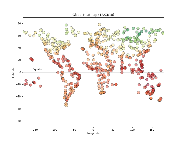
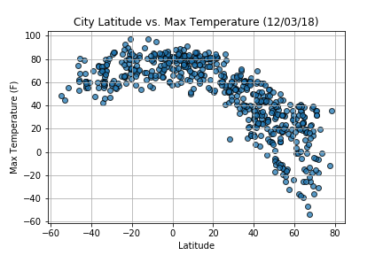
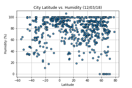
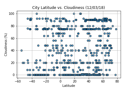
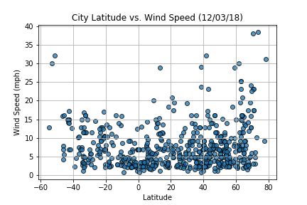
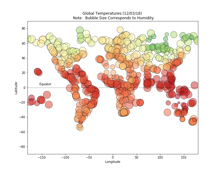
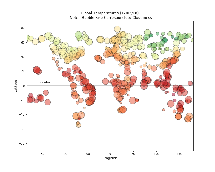
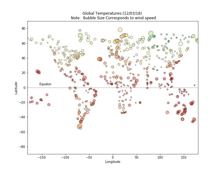
The purpose of this project was to analyze how weather changes as you get closer to the equator visualize this, we pulled the weather data from 500+ cities across the world of varying distance from the equator. To accomplish this, we are utilize an OpenWeatherMap API, and a little common sense to create a representative model of weather across world cities.
Objective is to build a series of scatter plots using Matplotlib, to showcase the relationship between various aspects of weather (Temperature,Humidity, Cloudiness, Wind Spped) vs. latitude.
This site provides the source data and visualizations created as part of the analysis, as well as explanations and descriptions of any treads or correlations witnessed.
